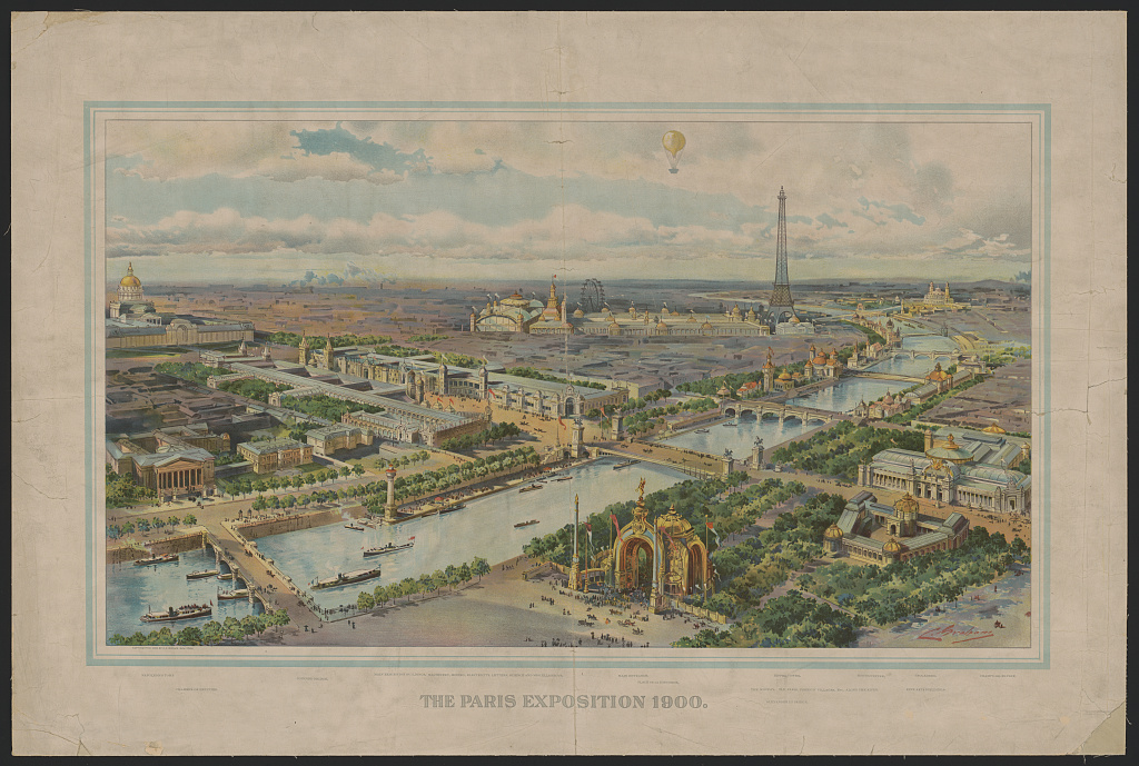
The Exposition Universelle de 1900 was a spectacular celebration of 19th century achievements that involved 40 countries and was visited by over 50 million people. A world’s fair held in Paris, France, the event highlighted the technological advancements and imperial power of mainly western European nations—with the notable exception of one small exhibit. A building at the fair dedicated to the “social economy” featured a U.S. exhibit that was supposed to focus on the history and “present conditions” of African Americans. Scholar, writer, and civil rights leader W.E.B. Du Bois had been asked to contribute a social study about African American life to the exhibit. He included 200 books written by African Americans, as well as 500 photographs highlighting their business enterprises, social life, and education. Also within the display were 63 charts, graphs, and maps, visualizing data mostly from the United States Census, Atlanta University reports, and various government agencies such as the U.S. Bureau of Labor. The data visualizations were divided into two parts. The first part was a case study of Black populations in Georgia, titled The Georgia Negro: A Social Study, and the second was more national and global in scope, titled A Series of Statistical Charts Illustrating the Condition of the Descendants of Former African Slaves Now in Residence in the United States of America.
-
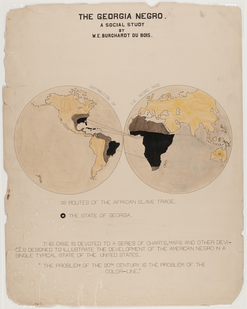
Du Bois, W. E. B. The Georgia Negro A social study / / By W. E. Burghardt Du Bois . Photograph. Retrieved from the Library of Congress, <www.loc.gov/item/2013650420/>.
-
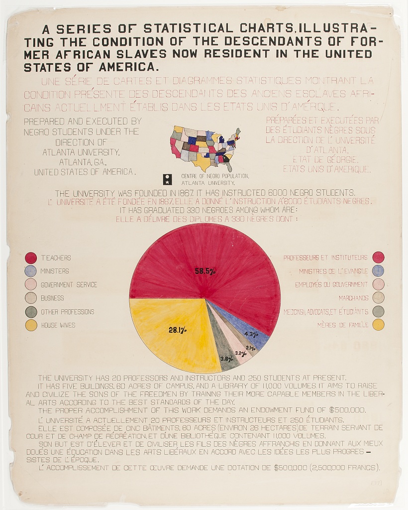
Atlanta University, and W. E. B Du Bois. A series of statistical charts illustrating the condition of the descendants of former African slaves now in residence in the United States of America / Prepared and executed by Negro students under the direction of Atlanta University, Atlanta, Ga., United States of America . Photograph. Retrieved from the Library of Congress, <www.loc.gov/item/2005676836/>.
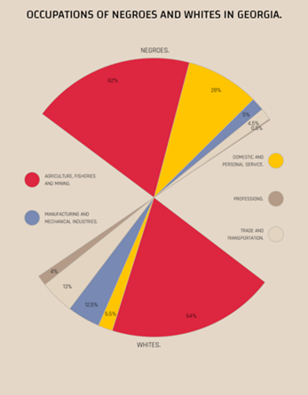
Now held within the digital collections of the Library of Congress, the data visualizations include conventional looking maps and graphs, like those pictured in the images above, but they also include some data visualizations, such as the ones below, which are quite unconventional by today’s standards.
-
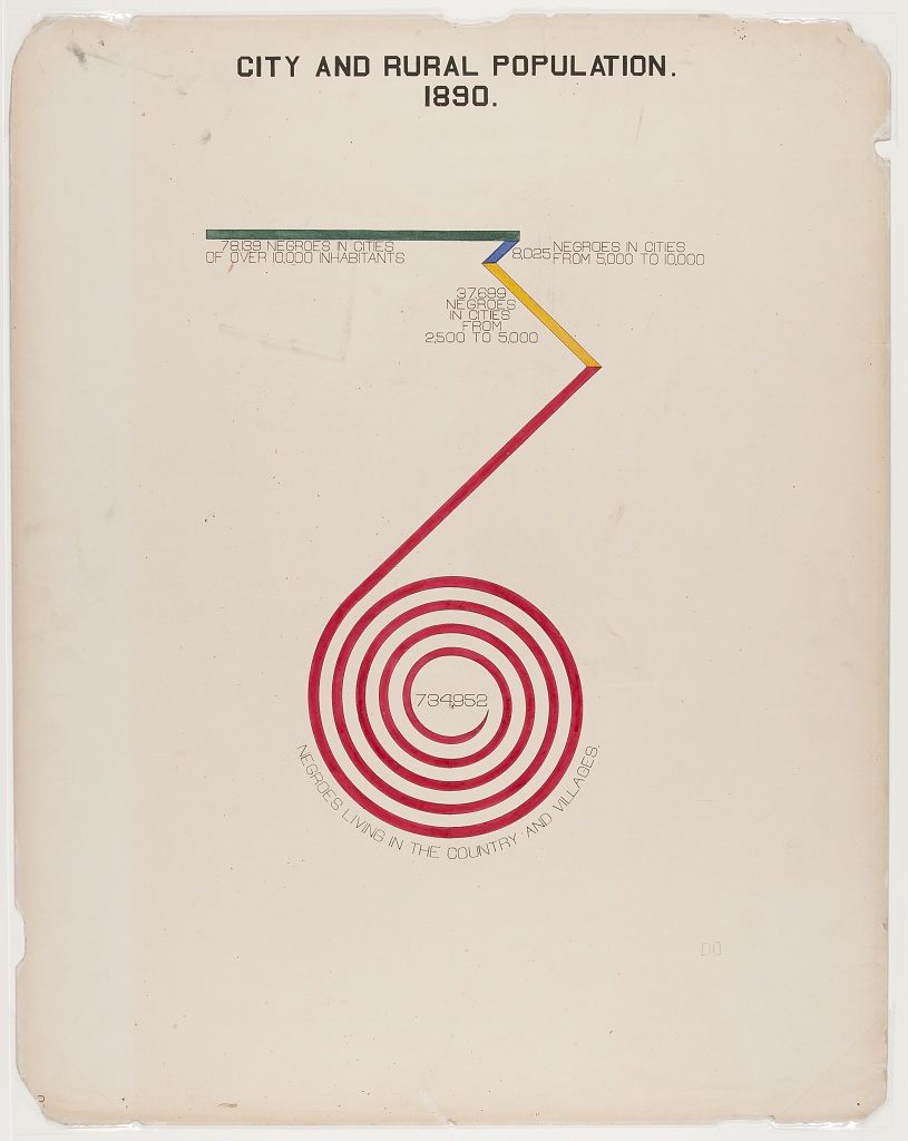
Du Bois, W. E. B. The Georgia Negro City and rural population . Photograph. Retrieved from the Library of Congress, <www.loc.gov/item/2013650430/>.
-
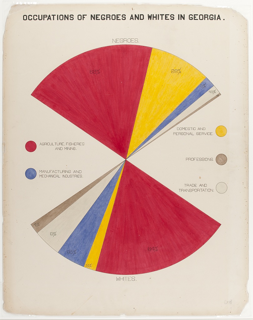
Du Bois, W. E. B. The Georgia Negro Occupations of Negroes and whites in Georgia . Photograph. Retrieved from the Library of Congress, <www.loc.gov/item/2005676812/>.
The editors of the book, Visualizing Black America, explain Du Bois’ unique work as combining visual art with social science and offering “alternative visions of how social scientific data might be made more accessible to the populations and people from whom such data is collected.” Individually and taken as a whole, Du Bois’ data visualizations told vivid stories about the rapid progress of Black Americans despite the racism and oppression they faced, and artfully countered many of the dominant narratives of the time—all in the midst of a huge celebration of white-dominated western progress. The stories Du Bois told with these data visualizations are as worthy of unpacking today as they were in 1900.
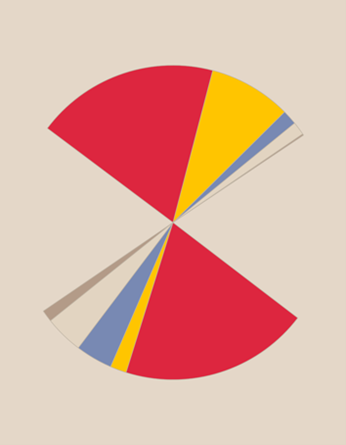
Yet, viewers of these data visualizations, particularly young and adolescent learners, may have trouble making sense of them. Research indicates that even modern maps and graphs can be difficult for students to interpret, let alone the unconventional data visualizations that were more common before the advent of computers. But what if you could strip down such data visualizations to their most basic geometries—to the signifiers and colors that encode the data, such as the line and tick marks on a timeline, the color-coded political units on a choropleth map, or the lines or bars on a graph? What if you could then slowly reveal the individual components of a data visualization so that students had adequate time to process the information each component provides, including its historical context and its broader meaning?
|
|
|
|
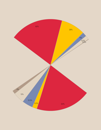
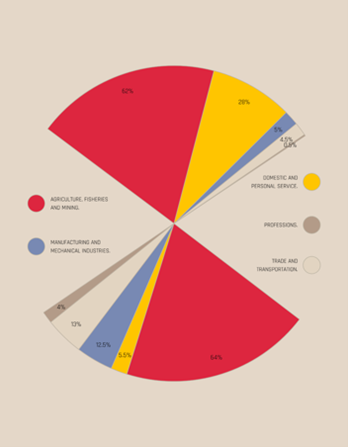
This process—the slow reveal process—was the basis of our Teaching with Primary Sources project. In the slow reveal process, teachers show students a stripped-down version of a data visualization and then encourage them to engage in discussion about what they notice and wonder. After this initial discussion, the teacher methodically reveals a new visual element in the data visualization. Each time they uncover an element, they pause and allow students sufficient time for observation, deep thinking, and class discussion, asking “What new information did we learn? How does this change your thinking about the graph? What do you wonder about now? What new information do we need?” This technique allows teachers to not only help students build their basic data literacy skills, but also supports critical data literacy by providing opportunities for students to voice their thoughts and perspectives, and allowing time to discuss issues such as inclusion and exclusion in data, racial and ethnic categorization, data distortion and manipulation, and the human implications of the data that are visualized. We wanted to help teachers teach critical data literacy using the slow reveal process, and to use primary source data visualizations—many of which were created around social justice or political issues.
Our Work
Using the software package R, we recreated primary source data visualizations from the Library of Congress and other sources so that we could provide them to teachers for use in slow reveal lessons. By recreating them in this way, we could simply use coding to strip and recover visual elements. In addition, we designed several complete slow reveal lesson plans, as well as some “starter” lesson plans that only needed instructional context according to teachers’ needs. We housed all these resources in a website titled Slow Reveal Graphics for Social Studies . We then designed a two-session professional learning opportunity (PLO) for history teachers to teach critical data literacy with primary source data visualizations from the Library of Congress website using the slow reveal technique.
In the first session of the PLO, we provided teachers with information on the importance of data literacy in history, emphasizing the importance of teaching critical data literacy. We also summarized research on how to support students’ comprehension of data visualizations. We then introduced teachers to the slow reveal method and how to use it with primary source data visualizations and provided teachers with access to our website. During the second PLO session, we modeled the slow reveal technique and provided time to debrief, work in small groups, and ask questions. We asked teachers to provide us with completed lesson plans within one month of the end of the PLO and analyzed the lessons to see how teachers planned to teach data literacy with primary source data visualizations and to what extent teachers incorporated critical data literacy practices.
What Did We Learn?
The teachers who participated reported feeling more confident in their ability to work with different kinds of data visualizations after the PLO, and that they felt more inclined to use primary source data visualizations. They also found the slow reveal process a compelling and useful way to teach about data visualizations. However, the lesson plans developed by teachers highlighted a clear need for continued professional development using the slow reveal technique. We concluded that we asked teachers to do too much with too little time. The PLO was multi-layered: it introduced teachers to teaching data literacy, gave them a new method for doing so, touted the importance of teaching critical data literacy, and emphasized doing so with primary sources, many of which were unfamiliar to them. Despite their belief that data literacy is important, and even though they reported feeling more efficacious in teaching data literacy and more inclined to teach with primary source data visualizations by the end of the session, asking them to teach data literacy with a primary source that was also new to them may have felt beyond their skillset at the time. Faced with so much information, most of the teachers chose to implement only a portion of our recommendations. They used the PLO mainly to “freshen up” or improve existing lessons by using the slow reveal method to help students understand information in secondary data visualizations they already knew about and used. That said, the teachers liked the slow reveal method and they said they wanted to use more primary source data visualizations in the future.
What's Next?
In order to continue the work developed through this regional grant, a new grant from the Library of Congress was secured in order to pursue our next steps. First, we are identifying more primary source data visualizations that connect directly to the topics teachers are required to teach in U.S. and world history classes and providing contextual information to help teachers better understand how they might use the primary sources and connect them to historical content. Second, we are recreating more of these data visualizations for the slow reveal process, including more full lesson plans since we realized teachers might need help with designing instruction around primary source data visualizations. Finally, we are building modules for asynchronous online professional development so teachers can work at their own pace to learn about teaching critical data literacy, how to analyze primary source data visualizations, and how to use the slow reveal process. All these resources will be housed in an expanded website on teaching data literacy in social studies, which you can get a sneak peek of here: https://www.dl4ss.com/.
